
Price action is a type of technical Forex trading that is based on the bare prices and charts instead of the usual indicators. Traders that employ various price action trading techniques believe that bare prices and charts can tell us everything we need and that indicators, while being helpful for calculating some statistical dependencies, create a time lag that can be critical in Forex. In fact, all indicators and any other methods are based on the data that is a part of a price action. So, price action is just a broad definition for the rather raw technical market data. The four techniques that are presented here aren’t the full set of price action trading instruments; they are just the most popular and interesting ones.
Tape Reading. The term refers to the times when the stock quotes came to the trading houses (more like the modern betting firms) in a form of a tape telegram. Traders analyzed the changes in the quotes, their speed and volume and, basing on this analysis, issued their trade orders. Modern tape reading in Forex is somewhat different — you just analyze the quote as it’s displayed in your broker’s terminal and then trade using your analysis of the data. It’s the most basic way of trading and some new traders start from it without knowing how is it called. Tape reading is mostly suitable for scalping and can’t be used for the long-term entries.
Japanese Candlestick Patterns. Many different patterns, formed by the Japanese candles, are recognized by the Forex traders. Such patterns are usually quite small (they consist of 1 to 4 candles) and can be spotted on all timeframes. Japanese candlestick patterns aren’t too reliable but the abundance of symbols compensates the low winning rate. This type of trading is a part of price action but it requires some basic chart analysis.
Chart Patterns. Patterns formed by the price fluctuations of the chart are numerous — triangles, wedges, double-tops, double-bottoms, head-and-shoulders and many others are all part of this trading technique. Opposite to the Japanese candlestick patterns these patterns are usually formed by many chart bars and often serve only for the long-term market evaluation. Chart patterns sometimes have a strong fundamental baselent and are thus valued by the professional traders and the Forex market tends to «follow» them simply due to their popularity.
Point-and-Figure Charts. This type is a bit more difficult than everything else in the price action domain. It’s also arguable that point-and-figure can be considered a price action technique at all. P&F charts are built based on the price changes, independently on time. The columns of X’s are formed when the price is rising, while the columns of O’s are formed during falling trends. The columns of X’s and O’s follow each after another. A price should pass a certain amount to form an O or X or reverse in an opposite direction for a significantly higher amount to start forming a new column. Trends can be easily read in such charts and many Forex traders use the strategy to buy and sell exactly at the new column’s start to catch the new trend.
Not all traders can use price action techniques successfully, the same as not everyone can trade with the indicators profitably. Price action can be used alone but it also can be interesting for other methods’ confirmation. With price action techniques you can always scale in and out and flexibly change your strategies as well.
Showing posts with label chart patterns. Show all posts
Showing posts with label chart patterns. Show all posts
Point-and-Figure Charting Explained
Point-and-figure charts (P&F) is another way to represent the price charts that can be used in Forex trading. Conventional charts display the price as the linear function of time, which results in a demonstrative picture of how the market behaved during certain periods of time. But the problem is that the trader often doesn’t need to know how price depended on time, all he needs is to know what the prevailing force on the market is at the moment — bulls or bears, demand or supply. That’s where P&F charts come handy. They show the price changes graphically, independently on the time during which the changes have occurred.
For example, the simple point-and-figure chart could look like this:

The green X’s are the price increases (by some certain value) and the red O’s are the price decreases. A column of X’s represent an uptrend, while the column of O’s represents a downtrend. In each given column there can be only X’s or O’s. When one trend ends a new column starts. As you see, there is no time scale in this chart. Each column can last an indefinite period of time.
So, how are these point-and-figure charts drawn? To start drawing a point-and-figure chart you should first set two important parameter values of the chart — the box size and the reversal distance.
The box size is the height of each of the O’s and X’s in pips. For example, if you set a box size to 10 pips, each X will mean an upward movement by 10 pips, so a column of 6 X’s is an upward movement by 60 pips. The same would be correct for the O’s.
The reversal distance is the amount of boxes that should be passed by a price in a reverse direction for a trend to reverse (to start a new column). The most common reversal distance is 3. That means that on a rising trend (a column of X’s) a price has to go down by the amount of pips in three boxes for a new column (this time — of O’s) to start. For example, if you use a box size of 10 and a reversal distance of 3: the price goes up by 60 pips, you draw 6 X’s, then the prices goes down by 30 pips (that’s more than 3 × 10), you draw 3 O’s down starting a new column from the level below the last X. If the price would go down by less than 30 pips you wouldn’t have to draw anything new. Basically, after drawing an X or O you just wait for the price to continue going in the direction for a box size of pips or in a reverse direction for a reversal distance * box size of pips.
If we consider 10 pips box size and reversal distance of 3 for the image above then we can say that first the price goes up by 50 pips during the first uptrend, then it goes down by about 50 pips, then goes an uptrend for 70 pips, then go two equal bearish and bullish trends for 30 pips (exactly the reversal distance). Then a price declines by 50 pips, then goes up by 30 pips and finally falls by 40 pips. It ends at +10 pips (if you sum up all the values) and, as you see on the picture, the ceiling of the final O is 10 pips above the bottom of the first X. That’s exactly +10 pips. The «effective price» is located at the bottoms of the X’s and at the tops of the O’s.
Using the point-and-figure charts is simple. Almost all chart patterns and analysis techniques that work with the classic time-based charts work with the point-and-figure charts too. The trends are very easy to visualize in the P&F charts because the square dimensions of the boxes (X’s and O’s) form nice 45-degree angle trendlines. Look at the example:

Apart from the chart pattern analysis, P&F charts offer a sort of trading signals. When the trend direction changes, a new position can be opened in this new direction with a stop-loss equal to the reversal distance. But such trading technique requires some thorough optimization of the box size and the reversal distance for the given currency pair and the market conditions.
If you have any questions or comments regarding point-and-figure charting, feel free to reply in the commentaries to this post.
Forex Chart Patterns
Trading with the chart patterns can be easy if you know how to distinguish them and how to place the entry and exit orders correctly. There are many different chart patterns recognized by the expert financial traders. But in my opinion, in Forex trading there are five most important and rather frequently appearing patterns: ascending, descending and symmetrical triangles and rising and falling wedges. Here you will find the models of these patterns and their descriptions:
Ascending Triangle
Generally, it’s a bullish continuation pattern but the breakout in each direction is possible. If you like taking risk you can go long immediately after you spot this pattern. But if you want to be careful it’s recommended to wait until breakout appears in either side. The most important parts of the ascending triangle are the horizontal line and the upwardly sloping line. It’s also important for the price rate to touch each of those lines at least twice before breakout. This rule is vital for all of the 5 Forex chart patterns presented in this article. As you can see on the image, the price has touched the sloping line three times and the horizontal line two times and then broke out through the latter. Stop-loss should be placed slightly below the horizontal line. As the moderate pull-back is possible, consider placing stop loss near 70% level on the way from the sloping line to the horizontal one in place of the breakout. Take-profit should be placed according to the auxiliary sloping line, which runs from triangle’s top-left angle parallel to the main sloping line. Consider placing your target at the auxiliary line’s level in place of the breakout.

Descending Triangle
Generally, it’s a bearish continuation pattern but the breakout in each direction is possible. As with the previous pattern you can go short immediately after you spot it. Wait for breakout in either side to enter a high-probability position. The most important parts of the descending triangle are the horizontal line and the downwardly sloping line. The price rate should touch each of those lines at least twice before breakout. As the image shows, the price has touched the sloping line three times and the horizontal line two times and then broke out down. Stop-loss and take-profit levels are placed using the same principles as with the ascending triangle.

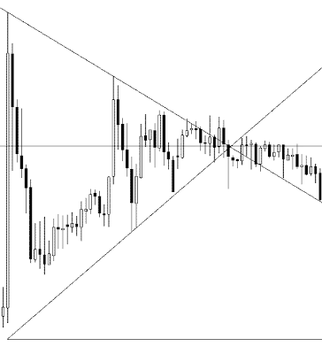
Symmetrical Triangle
Generally, it’s a continuation pattern that breaks out in the direction of the previous trend, but in practice breakout in every direction is possible. As always, you may decide to open a position in the direction of the previous trend immediately as you spot this triangle. If you wait for breakout then you have better chances of success. The most important parts of the symmetrical triangle are the downwardly and upwardly sloping lines and the horizontal line that bisects the angle created by the first two lines. The last line should be really horizontal (several degrees of error are allowable) or otherwise it’s some kind of a wedge but not a symmetrical triangle. As always, the price should touch each of the main sloping lines at least twice before breakout. Symmetrical triangle, which is shown on the image, breaks out downwardly after touching the bottom line three times and the top line multiple times. Stop-loss should be placed near 70% level on the way from the opposite sloping line to the horizontal line in the basement of the triangle (not the breakout point like before). Take-profit can be set near the auxiliary horizontal line, which runs from the top or bottom base angle (depends on the breakout direction) of the triangle and is parallel to the main horizontal line.
Rising Wedge
Usually, this chart pattern signals a reversal from the previous trend, but both upward and downward breakouts are possible. You can enter a risky trade immediately when you see this pattern. Wait for a clear breakout to enter a more probable trade. The crucial parts of the rising wedge are the two upwardly sloped lines that form a wedge. The price should touch each of them at least twice before breakout. On the image below you can see that the price touched top line two times and the bottom line multiple times. The downward breakout is shown. Stop-loss can be set at the auxiliary line that bisects the angle of wedge; set it near the level of the auxiliary line at the breakout. Take-profit is set near the auxiliary line (not shown on the image) that runs from the top or bottom base angle (depending on the breakout direction) of the wedge and is parallel to the opposite sloping line. E.g. in the picture’s example wedge the line should start at the bottom angle of the wedge and be parallel to the top sloping line. Take-profit should be placed near the level of that auxiliary line at breakout.

Falling Wedge
As its rising cousin, this chart pattern often signals a reversal from the previous trend, but both upward and downward breakouts are still possible. To enter a risky trade, open it immediately as you see this chart pattern. Wait for a clear breakout to enter a more probable trade. The main parts of the falling wedge are two downwardly sloped lines that form a wedge. The price should touch each of them at least twice before breakout. On the image you can see that the price touched the bottom line two times and the top line multiple times. Upward breakout is shown. Stop-loss and take-profit levels are set using the same principles as with the rising wedge.

If you have your own opinion or questions about Forex chart patterns, feel free to leave it in a comment to this post.
Ascending Triangle
Generally, it’s a bullish continuation pattern but the breakout in each direction is possible. If you like taking risk you can go long immediately after you spot this pattern. But if you want to be careful it’s recommended to wait until breakout appears in either side. The most important parts of the ascending triangle are the horizontal line and the upwardly sloping line. It’s also important for the price rate to touch each of those lines at least twice before breakout. This rule is vital for all of the 5 Forex chart patterns presented in this article. As you can see on the image, the price has touched the sloping line three times and the horizontal line two times and then broke out through the latter. Stop-loss should be placed slightly below the horizontal line. As the moderate pull-back is possible, consider placing stop loss near 70% level on the way from the sloping line to the horizontal one in place of the breakout. Take-profit should be placed according to the auxiliary sloping line, which runs from triangle’s top-left angle parallel to the main sloping line. Consider placing your target at the auxiliary line’s level in place of the breakout.

Descending Triangle
Generally, it’s a bearish continuation pattern but the breakout in each direction is possible. As with the previous pattern you can go short immediately after you spot it. Wait for breakout in either side to enter a high-probability position. The most important parts of the descending triangle are the horizontal line and the downwardly sloping line. The price rate should touch each of those lines at least twice before breakout. As the image shows, the price has touched the sloping line three times and the horizontal line two times and then broke out down. Stop-loss and take-profit levels are placed using the same principles as with the ascending triangle.

Symmetrical Triangle
Generally, it’s a continuation pattern that breaks out in the direction of the previous trend, but in practice breakout in every direction is possible. As always, you may decide to open a position in the direction of the previous trend immediately as you spot this triangle. If you wait for breakout then you have better chances of success. The most important parts of the symmetrical triangle are the downwardly and upwardly sloping lines and the horizontal line that bisects the angle created by the first two lines. The last line should be really horizontal (several degrees of error are allowable) or otherwise it’s some kind of a wedge but not a symmetrical triangle. As always, the price should touch each of the main sloping lines at least twice before breakout. Symmetrical triangle, which is shown on the image, breaks out downwardly after touching the bottom line three times and the top line multiple times. Stop-loss should be placed near 70% level on the way from the opposite sloping line to the horizontal line in the basement of the triangle (not the breakout point like before). Take-profit can be set near the auxiliary horizontal line, which runs from the top or bottom base angle (depends on the breakout direction) of the triangle and is parallel to the main horizontal line.

Rising Wedge
Usually, this chart pattern signals a reversal from the previous trend, but both upward and downward breakouts are possible. You can enter a risky trade immediately when you see this pattern. Wait for a clear breakout to enter a more probable trade. The crucial parts of the rising wedge are the two upwardly sloped lines that form a wedge. The price should touch each of them at least twice before breakout. On the image below you can see that the price touched top line two times and the bottom line multiple times. The downward breakout is shown. Stop-loss can be set at the auxiliary line that bisects the angle of wedge; set it near the level of the auxiliary line at the breakout. Take-profit is set near the auxiliary line (not shown on the image) that runs from the top or bottom base angle (depending on the breakout direction) of the wedge and is parallel to the opposite sloping line. E.g. in the picture’s example wedge the line should start at the bottom angle of the wedge and be parallel to the top sloping line. Take-profit should be placed near the level of that auxiliary line at breakout.

Falling Wedge
As its rising cousin, this chart pattern often signals a reversal from the previous trend, but both upward and downward breakouts are still possible. To enter a risky trade, open it immediately as you see this chart pattern. Wait for a clear breakout to enter a more probable trade. The main parts of the falling wedge are two downwardly sloped lines that form a wedge. The price should touch each of them at least twice before breakout. On the image you can see that the price touched the bottom line two times and the top line multiple times. Upward breakout is shown. Stop-loss and take-profit levels are set using the same principles as with the rising wedge.

If you have your own opinion or questions about Forex chart patterns, feel free to leave it in a comment to this post.


